Comcast “Clickable Card” Component
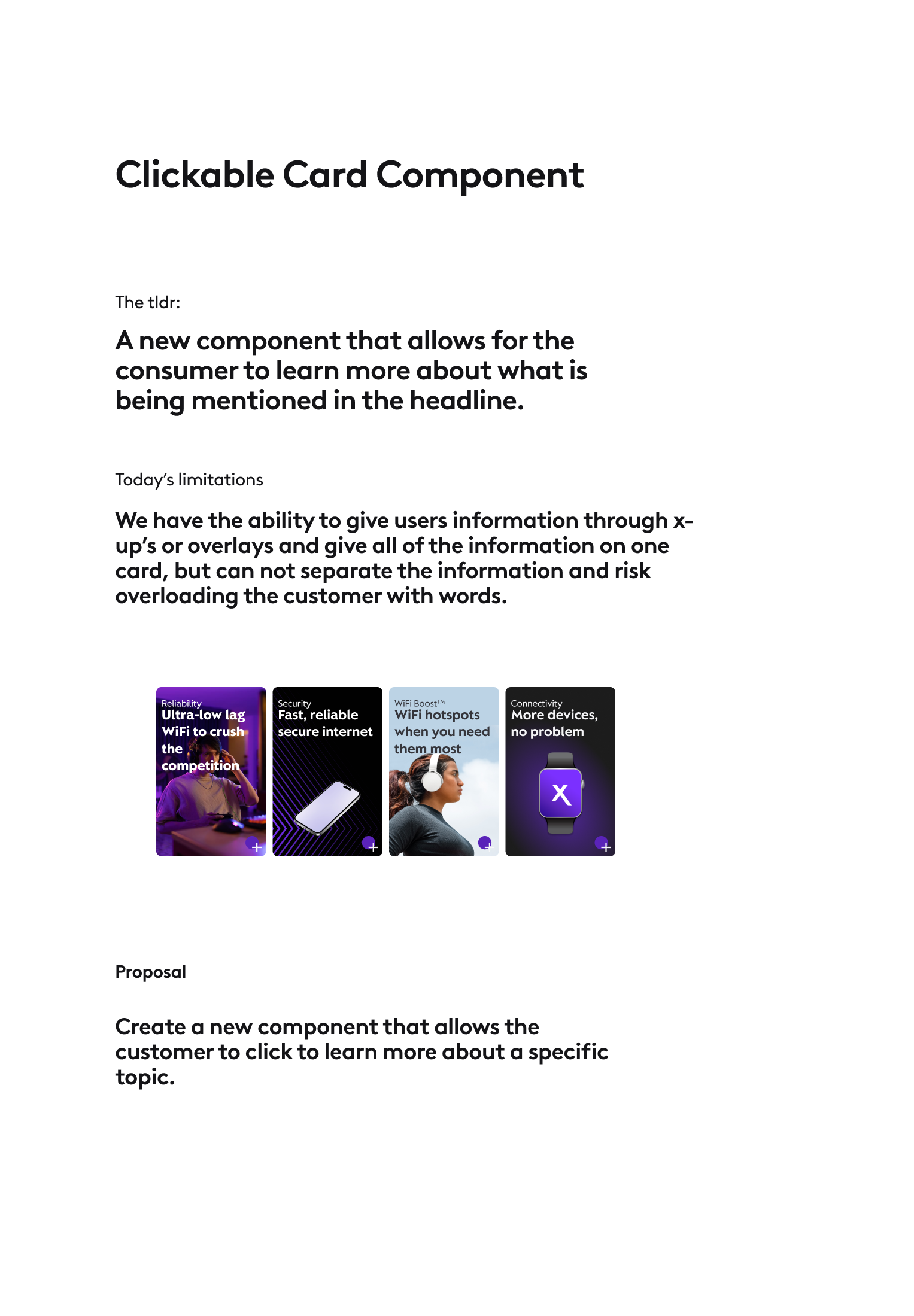
While at Comcast, one of the things I was instructed to create was a clickable card component. It allows designers to understand how different content blocks would look with an eyebrow, an eyebrow image, a content box (body text, disclaimer, terms and conditions), a clickable button, and a background image.
Each feature (eyebrow, content box, etc.) is a boolean expression that allows the designer to choose whether to use it. For example, you can have one use case with an eyebrow, headline, and background image as shown below, but without anything else. This component gives designers the freedom to explore different situations more easily and quickly than they could before.
This component was published and is now visible across all Comcast sites.
Examples from Comcast Website
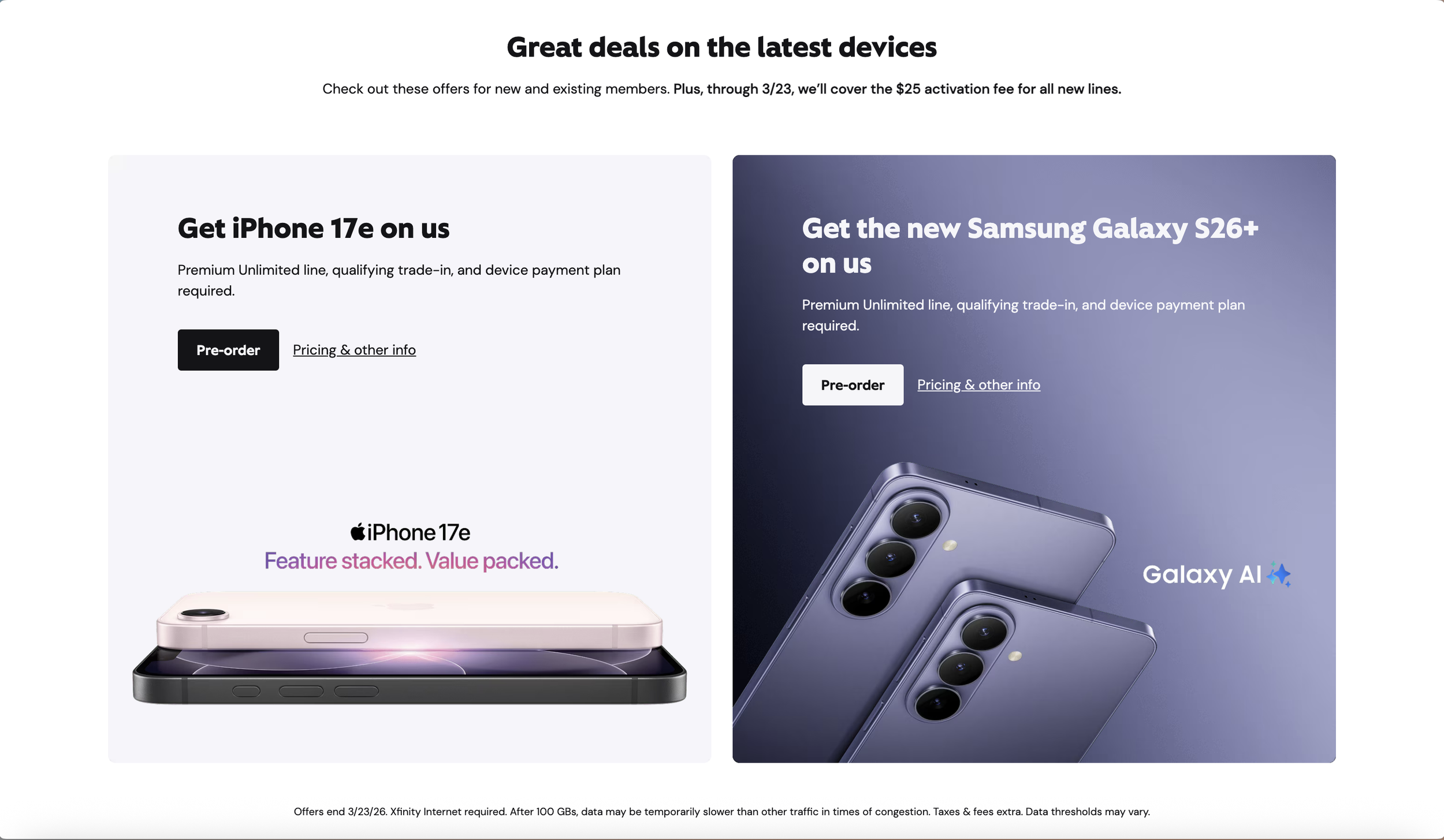
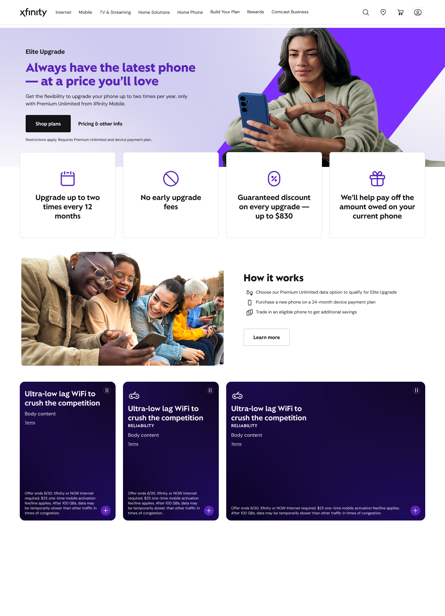
The clickable card as seen on the Comcast website
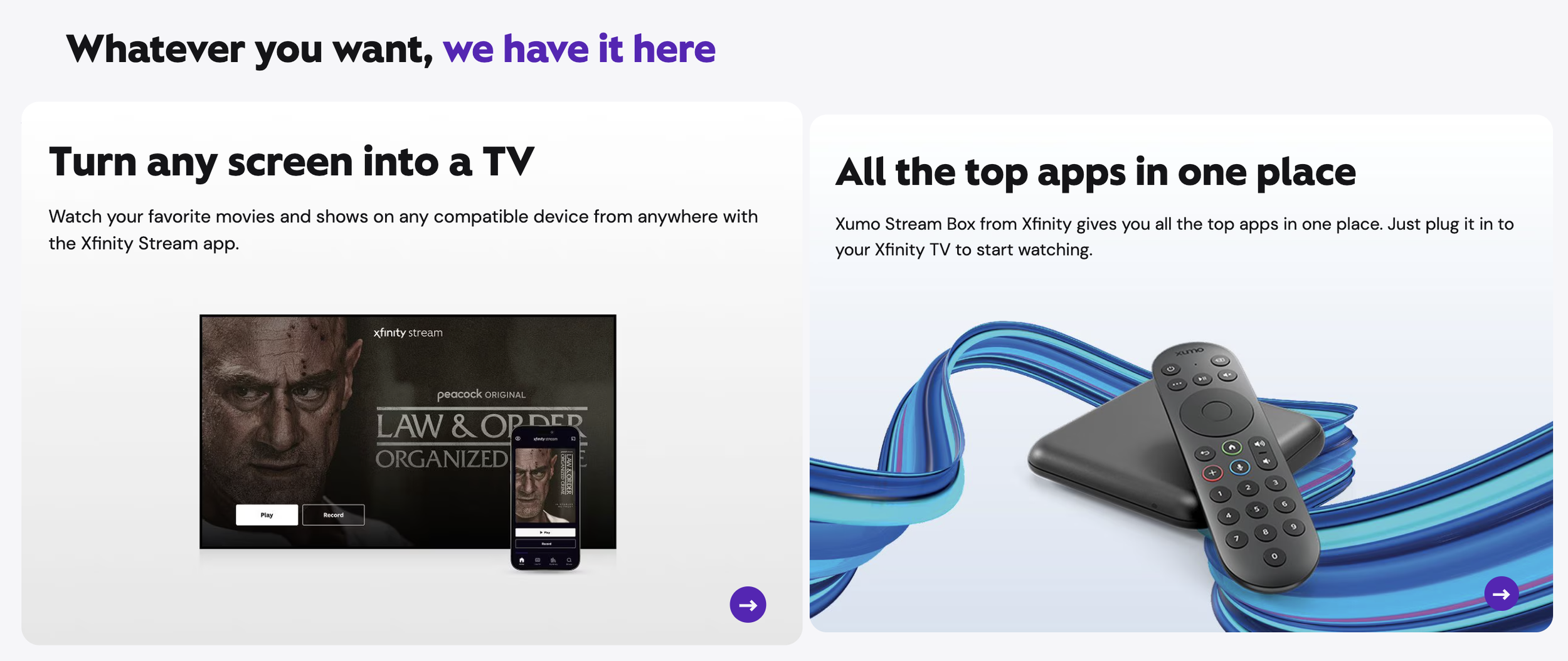
The clickable card as seen on the Comcast website
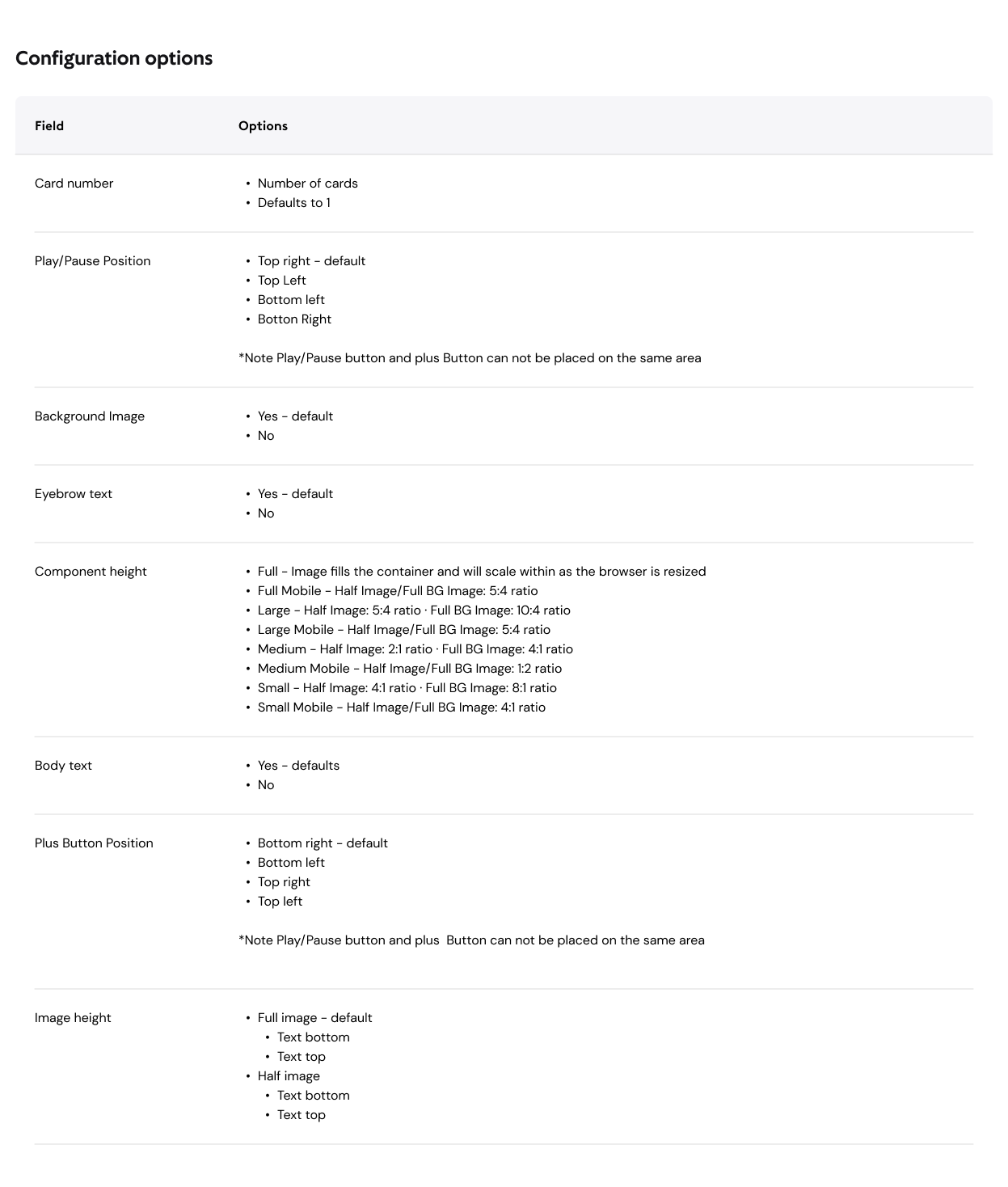
Documentation of the Clickable Card
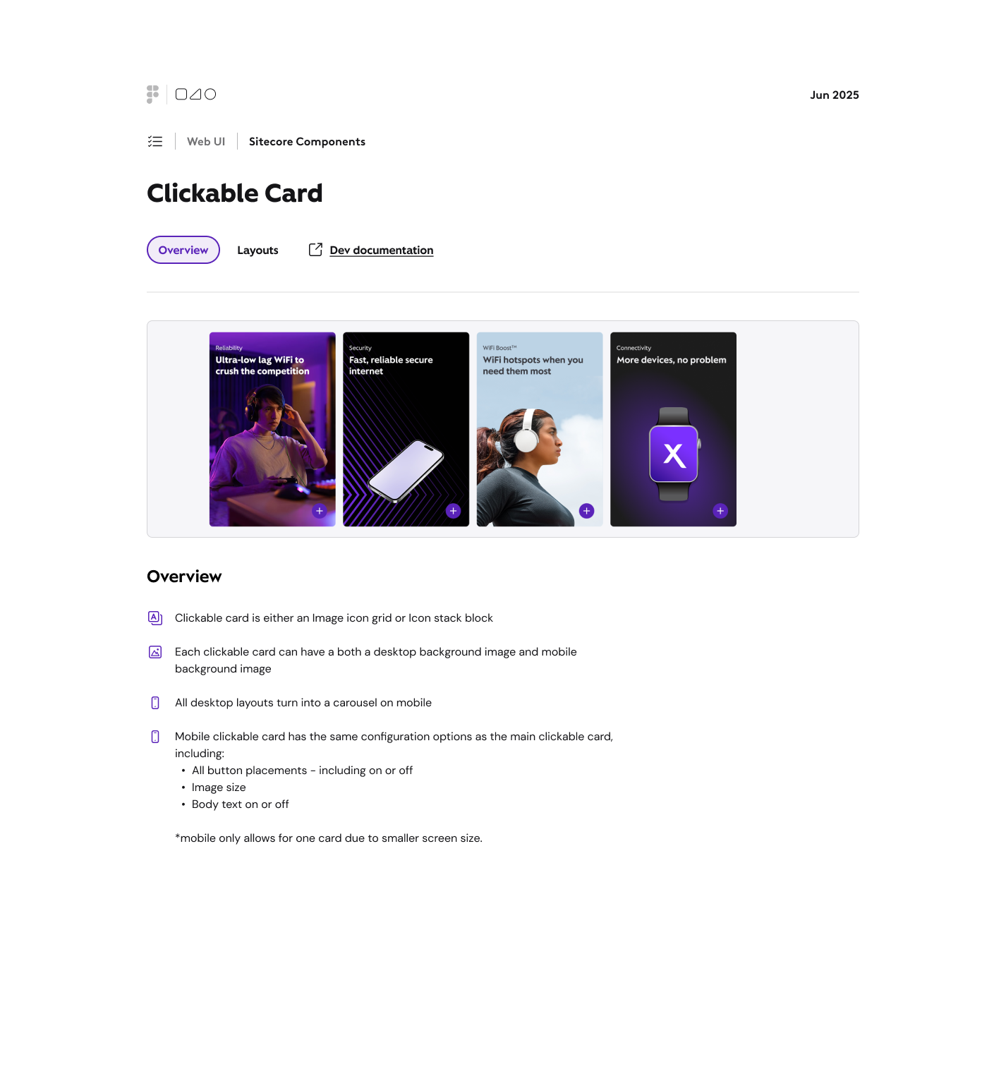
Documentation for the “Clickable Card”
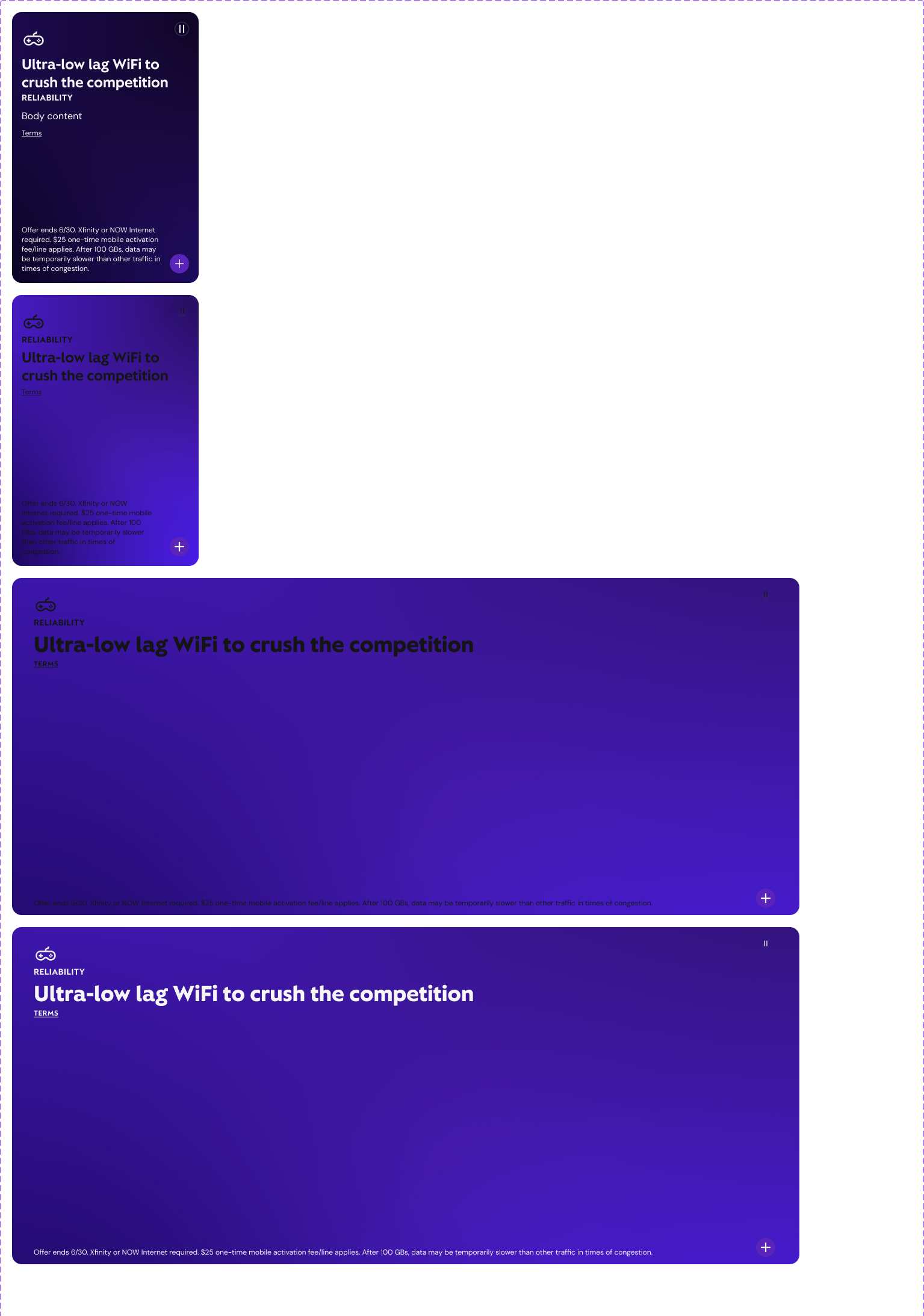
Demo Mockup
Demo Mockup of how they can be places on a webpage
The Component Itself
The actual Clickable Card Component