Nest Egg
Role: UX Designer/Researcher
Date: April 2025
Turn-around Time: 1 Month
Background
I recently took a class on dark patterns and the manipulative use of design. For our final project, we were put into groups and worked with a client to build their dream product. Our goal was to create their ideal product while reducing the amount of dark patterns the client had. My group was given the idea of Nest Egg, an app for kids that promotes parenthood and helps kids learn through a fun, game-like experience.
In short, we studied games like My Talking Tom, Pou, and the much-missed Fig-pals from Figma to find our design style. From there, we created a similar game, including micro-transactions, since we realized there was no way to completely remove all dark patterns.
If you’re curious to dive deeper into the designs or just want to check out pictures of our process, look below. 🤙
Starting out
We started by creating a FigJam file to gather our ideas on how to tackle the challenge of creating an app for kids that helps them learn about parenthood.
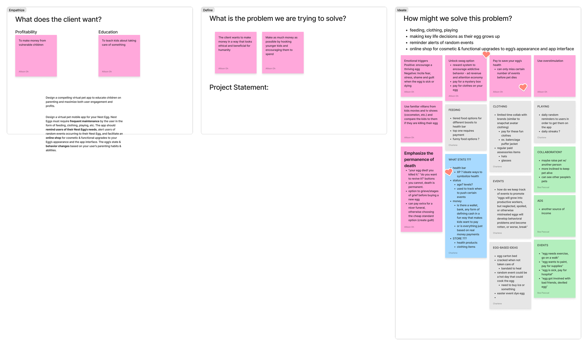
Figjam brainstorm to gather our ideas
Competitive Analysis
To decide on our color choices and type styles, we conducted competitive analysis using some of our favorite childhood games. This helped us understand the landscape and identify what we liked and didn’t like.
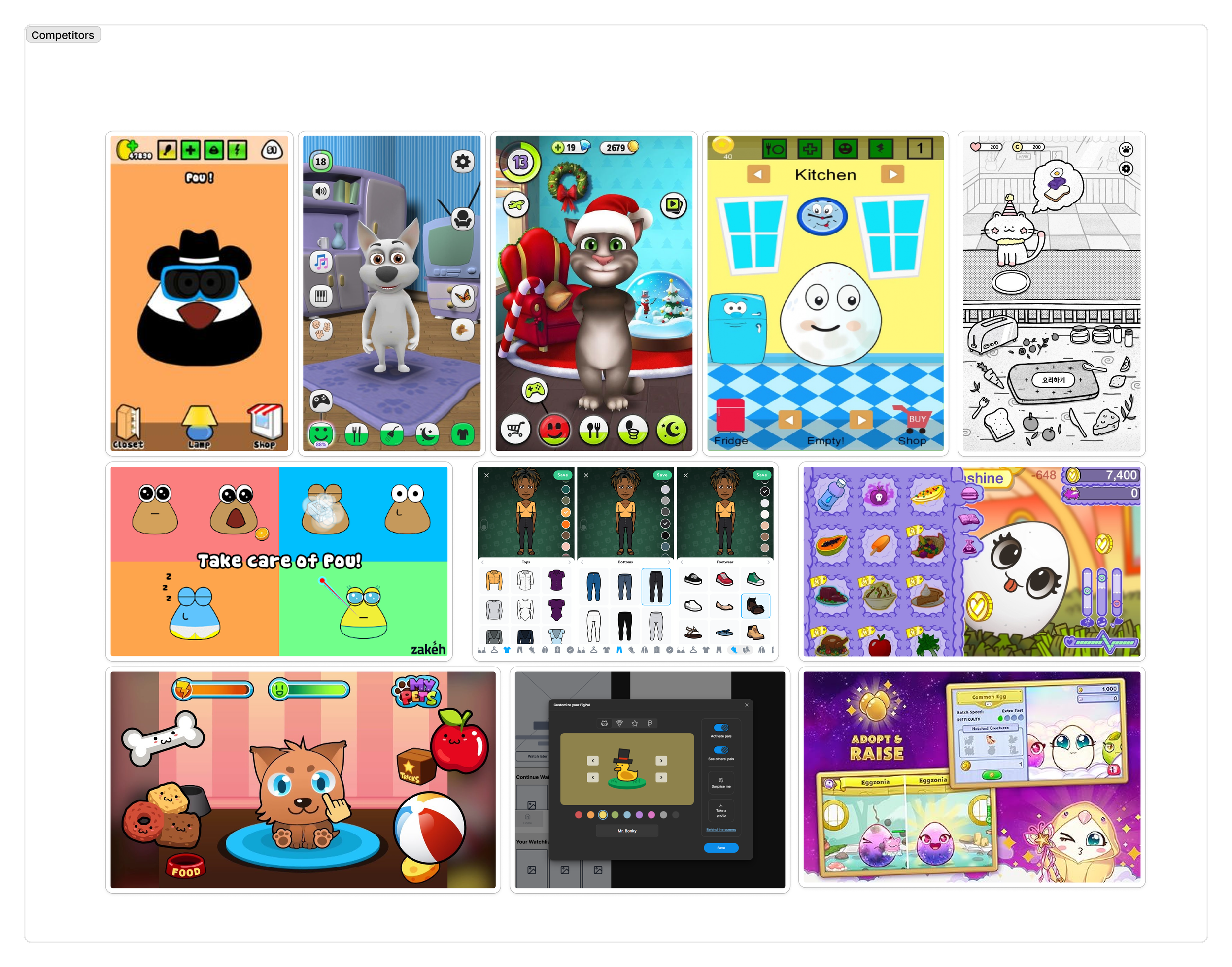
Competitive Analysis for Nest Egg
Gathering User Data
Before starting the design, we knew it was important to get feedback to understand what would work and what wouldn’t, so we conducted some user testing.

User Testing Feedback
Branding
For our app, we decided to use brighter, more friendly, and fun colors and type choices to better connect with children and make the app as engaging as possible.

Branding for Nest Egg
The Low-fi version
After gathering user feedback and finalizing our branding, we began designing the app. First, we created a hand-drawn version to get a sense of the screens we wanted and how the app flow should work before moving into Figma. This initial sketch was key to creating the best design possible.
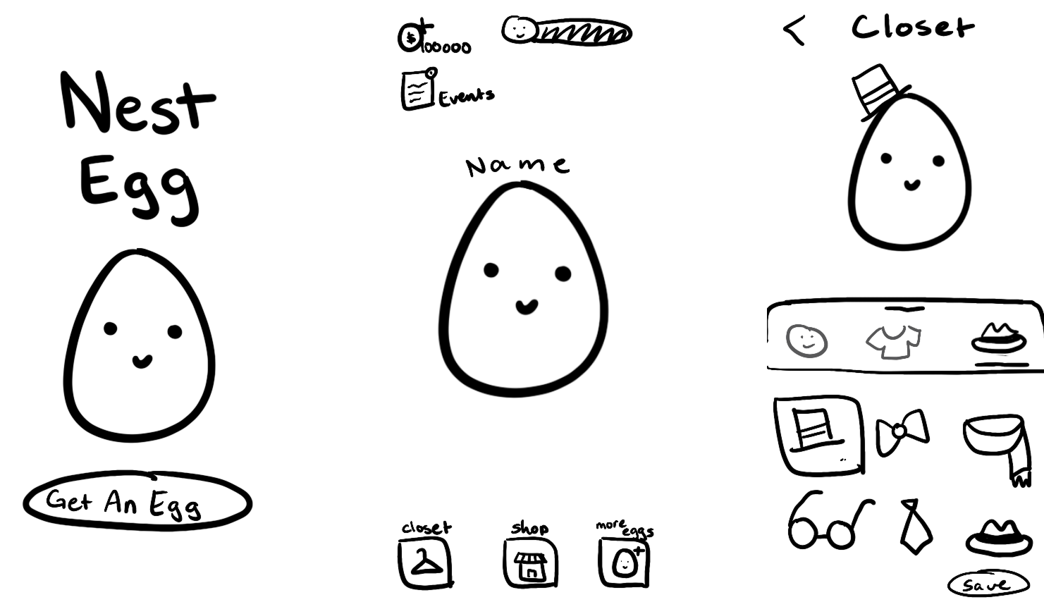
Low-fi version of Nest Egg
The Final Design
The final version of the app stayed close to our low-fi design, but of course, we had to make it look much better—after all, why work in low-fi when you can work in high-fi? We took our time with the final design to make it as polished as possible. We combined everything from the process you hopefully read above into one fantastic app.
Hope your enjoy it. 😁
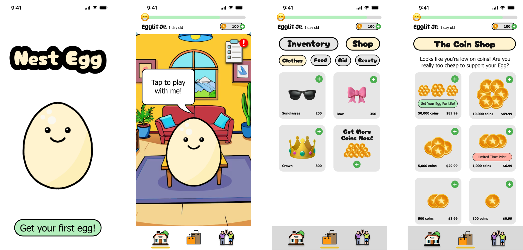
Still Images of Nest Egg