zant
Role: UX Design Intern
Date: July - September 2024
Background
Last summer (2024), I was able to join the Zant team as a UX design intern. As for what Zant is, they’re a mental health app start-up that focuses on giving a smoother connection between who is giving help and who is receiving it. They have recently shifted focus from mental health to a female-led and focused coaching group that helps coaches find their way in today’s environment.
When I was a part of the team, I helped build layouts of the desktop and app page when they were still focused on helping in the mental health front.
I worked on a couple of key areas for Zant, those include: The profile & settings section for desktop and mobile, as well as the desktop sign-up flow.
All in all, it was a great experience and one that I learned a lot from, not only learning about new ways to use Figma, but also how to work within the UI/UX field in a professional environment.
For more details, look below.👇
Branding
When I first started, we as a company were unsure where we wanted to go with our colors and type. Because of this, I turned to the web to look at some mental health companies that were already well established, such as BetterHelp, Headspace, and Calm. I created accounts with these sites to figure out their flows and how users moved through their apps. I also took notes on color and type, so I could figure out what would feel calming to the user while being unique to Zant.
I ended up going with Neue Haas Grotesk as the main font as I felt it was loud enough to be unique compared to the fonts from BetterHelp, Headspace, and Calm, but also was readable to users, so people would still understand what was going on. And to pair with that, I chose Roboto as the body font as it is readable to users and works well with Neue Haas Grotesk.
The logo was already determined by the time I got on board, so I just had to figure out what colors would be best. I worked with the other people on the team to figure out what vibe and feeling they wanted Zant to have. We ended up going with Hot Pink (#EF0CAF), Bright Cyan (#45EBFA), and lastly Neon Yellow (#FFFF00) for the colors. We wanted Zant to connect to college students and younger individuals since they are more prone to thoughts of self-harm, and we just thought it looked cool and more fun compared to the colors of the competitors.
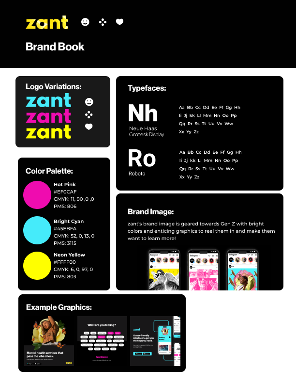
zant branding
Desktop Sign-up
When creating the desktop flow and design for the user sign-up I looked at the onboarding of other mental health apps but also other apps and games in general. I then came up with the design and flow you see below. It gives the user a sense of consecutiveness and helps them feel as if they are a member of the zant family. As for the rest of the flow it follows a traditional user onboarding flow in order to make the sign up simple and easy for the user.
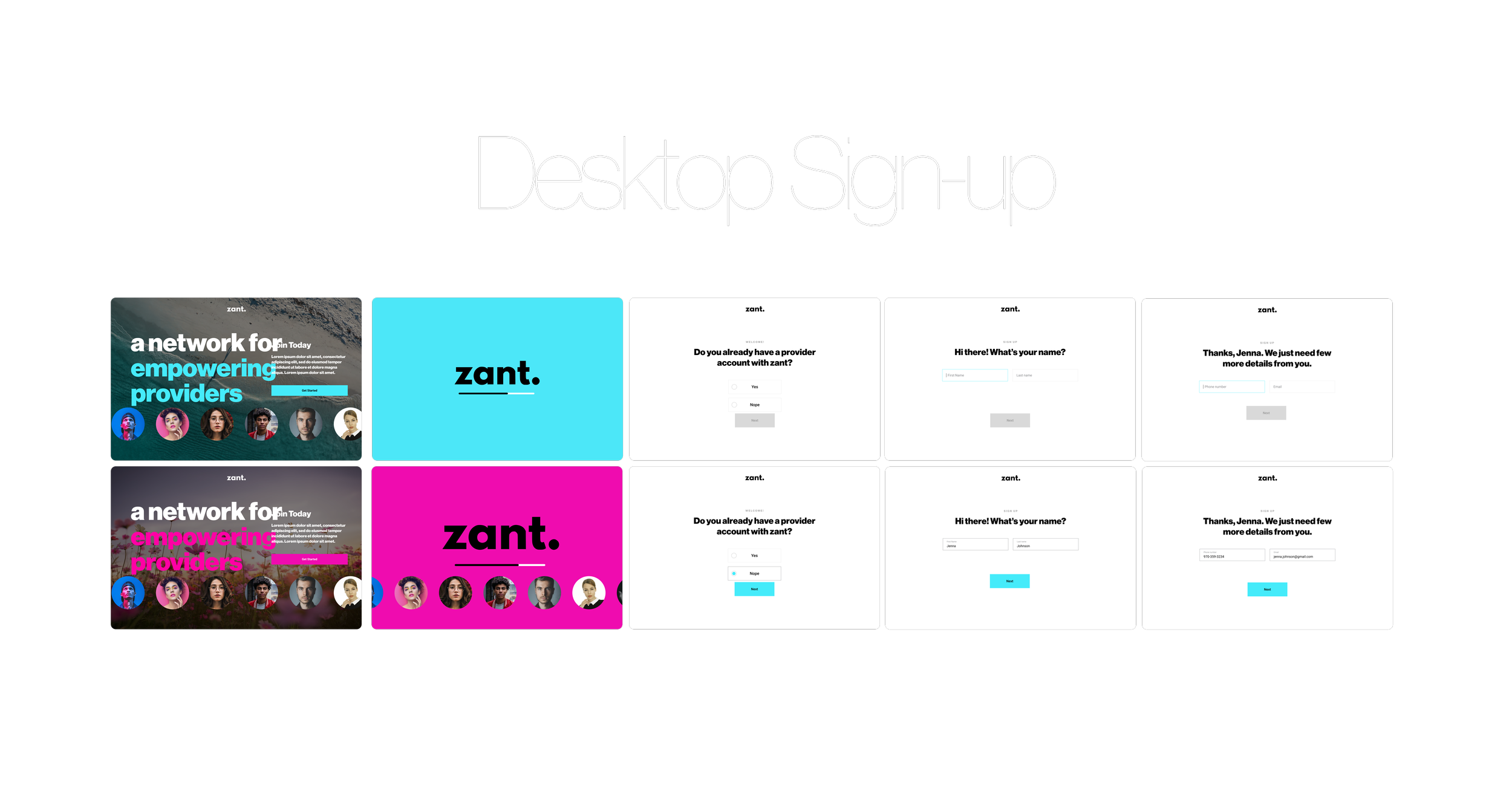
Layout and flow of zant sign-up
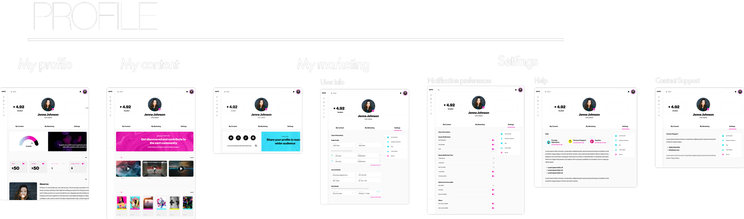
Profile & Settings Desktop
The profile and settings pages followed a similar approach to how I created the onboarding layouts, but with the changes of figuring out menu placement as well as the flow for the user.
In terms of figuring out the menu I thought about what is most commonly found in apps and websites and found the hamburger menu to be almost everywhere. With that I wanted to create something similar to the side bar from X and stay away from the hamburger menu in case there would be an issue with clicking on the wrong area when trying to navigate through. This thought processes was helpful as in order to create a cohesive app the sidebar/menu would need to be consistent between desktop and mobile.
As for the flow I wanted to give the user something simple to navigate, but also simple to look at. I chose to put all the information a user would on the first page so the user didn’t have to click through pages and pages in order to figure out how much they are charging (if they are a coach) or how much they owe (as a person looking for help)
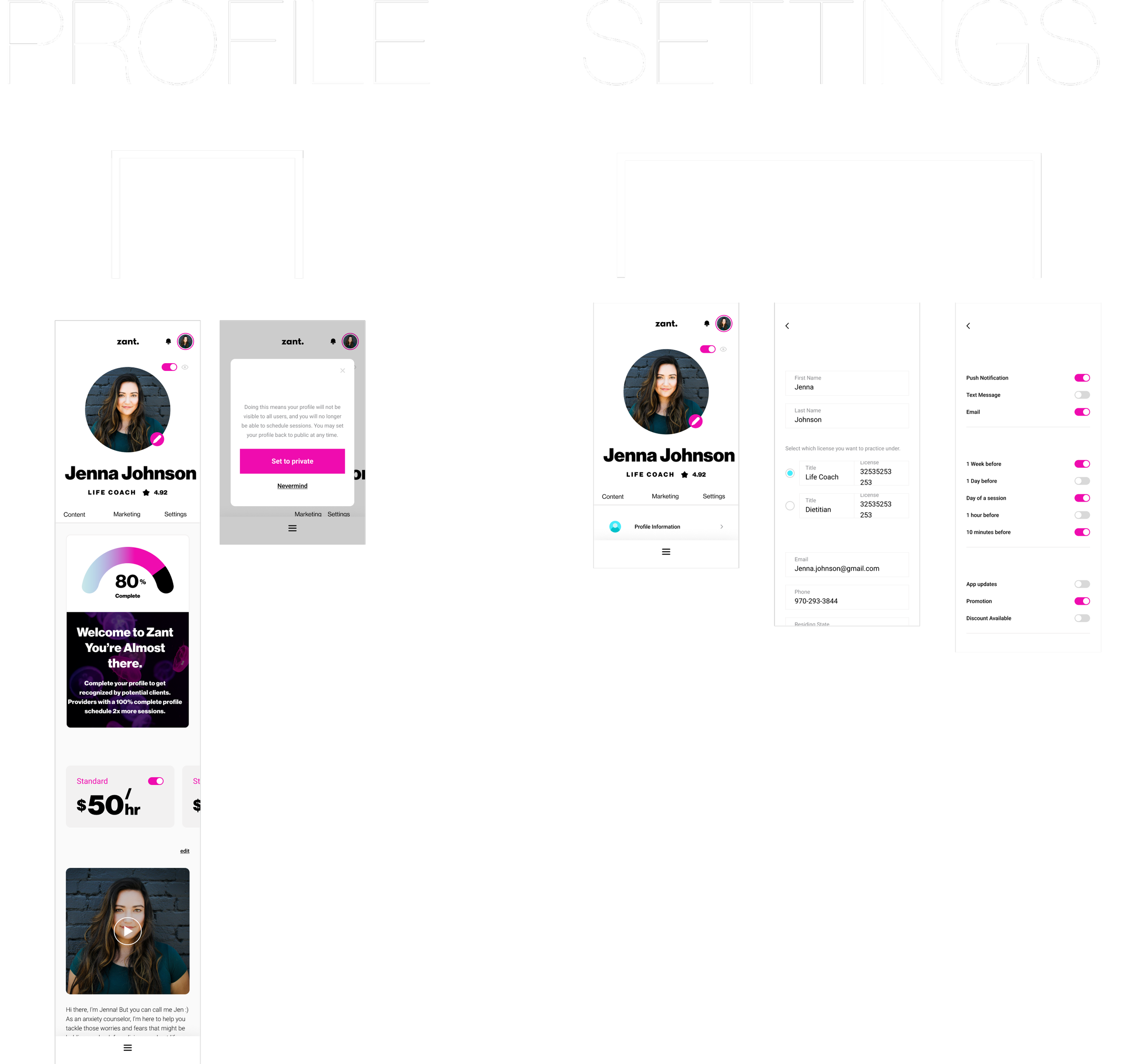
Profile & Settings Mobile
In terms of the mobile version of the profile and settings I followed the same layout I created above so that if a user used both the desktop and mobile version of zant they’re would be no issue navigating or understanding what was in front of them.